A CLEAN, CONFIDENT AND CONTEMPORARY FASHION E-COMMERCE REDESIGN
Introduction
Chic Chic is a premium multi-brand fashion retailer offering curated collections from established international designers and emerging luxury labels.
The brand blends contemporary style with timeless pieces, creating a destination where customers can discover high-quality clothing, accessories and complete outfits in one place.
My role
I led the end-to-end UX and UI redesign, from research and audit to information architecture, wireframes, high-fidelity design and developer handoff, working directly with all stakeholders throughout the project.
Tools
Figma, FigJam, Notion, Photoshop, Google Meet.
Why a redesign?
BEFOREAFTER
Chic Chic’s existing website no longer reflected the brand’s premium positioning nor the expectations of its customers.
👉 navigation was unclear 👉 product discovery felt fragmented 👉 essential information was difficult to access 👉 checkout process was lacking clarity
These issues affected trust, slowed decision-making and created friction throughout the shopping flow.
A full redesign was necessary to reestablish clarity, elevate the brand’s digital presence and create an experience that supports how users actually browse and buy premium fashion.
Solution
The result is a foundation for a scalable digital presence, designed to increase engagement, reduce friction and position the e-commerce competitively within the premium fashion landscape.
Segmented landing pages
The redesign begins with segmented landing pages for Women and Men, giving users an immediate sense of direction and presenting only the products relevant to their shopping intent.
This structure removes early friction, reduces cognitive load and mirrors how premium fashion is curated offline. Each landing page sets its own visual tone while maintaining a cohesive brand identity.
Product listing experience
The product listing experience was rethought to prioritize clarity and fast decision-making.
I introduced a mobile-first filtering system that surfaces filters instantly, shows applied selections clearly and keeps the layout clean.
Product cards were redesigned for hierarchy, readability and brand recognition, allowing users to scan collections without interruptions.
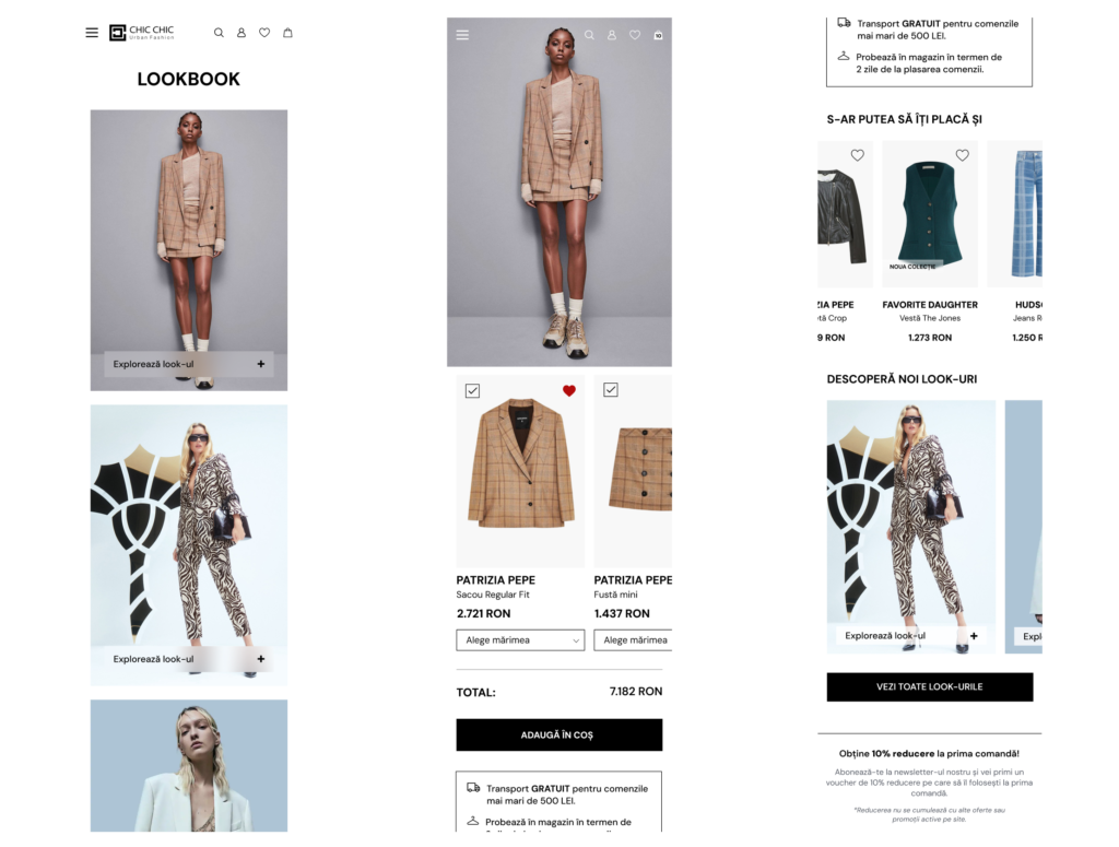
Lookbook
A dedicated Lookbook was added to address the user need for curated outfits rather than isolated items.
The new Lookbook presents full looks with a clear flow into “Shop the Look,” allowing users to explore coordinated pieces effortlessly.
This approach transforms browsing into an editorial, inspiration-led experience that aligns with premium retail expectations.
Product page
The product page was rebuilt to deliver structure, trust and transparency.
Information is now grouped logically, imagery takes clear priority, and details such as sizing, materials and delivery are consistent and easy to access.
The layout supports both quick decisions and deeper exploration, adapting to different shopping behaviors.
Checkout process
The checkout process was reorganized into a predictable, streamlined flow.
Instead of one long page, the structure guides users step by step, ensuring clarity at every stage.
Trust elements, delivery expectationsand price transparency are visible throughout, reducing hesitation and supporting a frictionless completion of the purchase.
The Process
Discovery phase
Understanding the Business
The discovery phase established the foundation of the entire project.
Before approaching structure or visual direction, I needed a clear understanding of how Chic Chic operated, what the brand represented and where the existing experience was failing both the business and its customers.
Stakeholder Conversations
Conversations with stakeholders revealed the gaps between brand intention and user reality.
Through several meetings, I mapped internal goals, uncovered operational challenges and clarified expectations for the new platform.
Aligning Expectations
Aligning everyone early prevented assumptions and grounded the entire project in shared clarity.
The insights from this phase highlighted how users actually interacted with the website and how far that behavior was from the desired premium experience.
UX Audit
Before defining the new structure, I conducted a detailed audit of the existing website to understand how users interacted with it and where the experience was breaking.
The analysis revealed:
👉 inconsistent hierarchy 👉 unclear navigation paths 👉 missing product information 👉 weak mobile filter visibility 👉 a checkout flow that created unnecessary friction
These findings exposed the gap between the brand’s premium intention and the actual user experience.
💡 The audit provided a clear, objective baseline that guided every design decision that followed, ensuring the redesign addressed real issues rather than assumptions.
Competitive Audit
The competitive audit revealed several patterns that consistently improve the user experience in premium platforms.
👉 Competitors give users a higher level of control and customization throughout the browsing and purchasing flow.
👉 Information is always up to date and easy to access, reducing uncertainty during decision making.
👉 Navigation between pages is clear and predictable, allowing users to move seamlessly between discovery and purchase.
👉 The experience is designed to connect userswith what they need quickly, without unnecessary steps.
👉 Strong trust signals and transparencybuild credibility and confidence throughout the journey.
💡 These insights defined the baseline expectations for the Chic Chic redesign and informed the structural decisions made across navigation, product discovery and checkout.
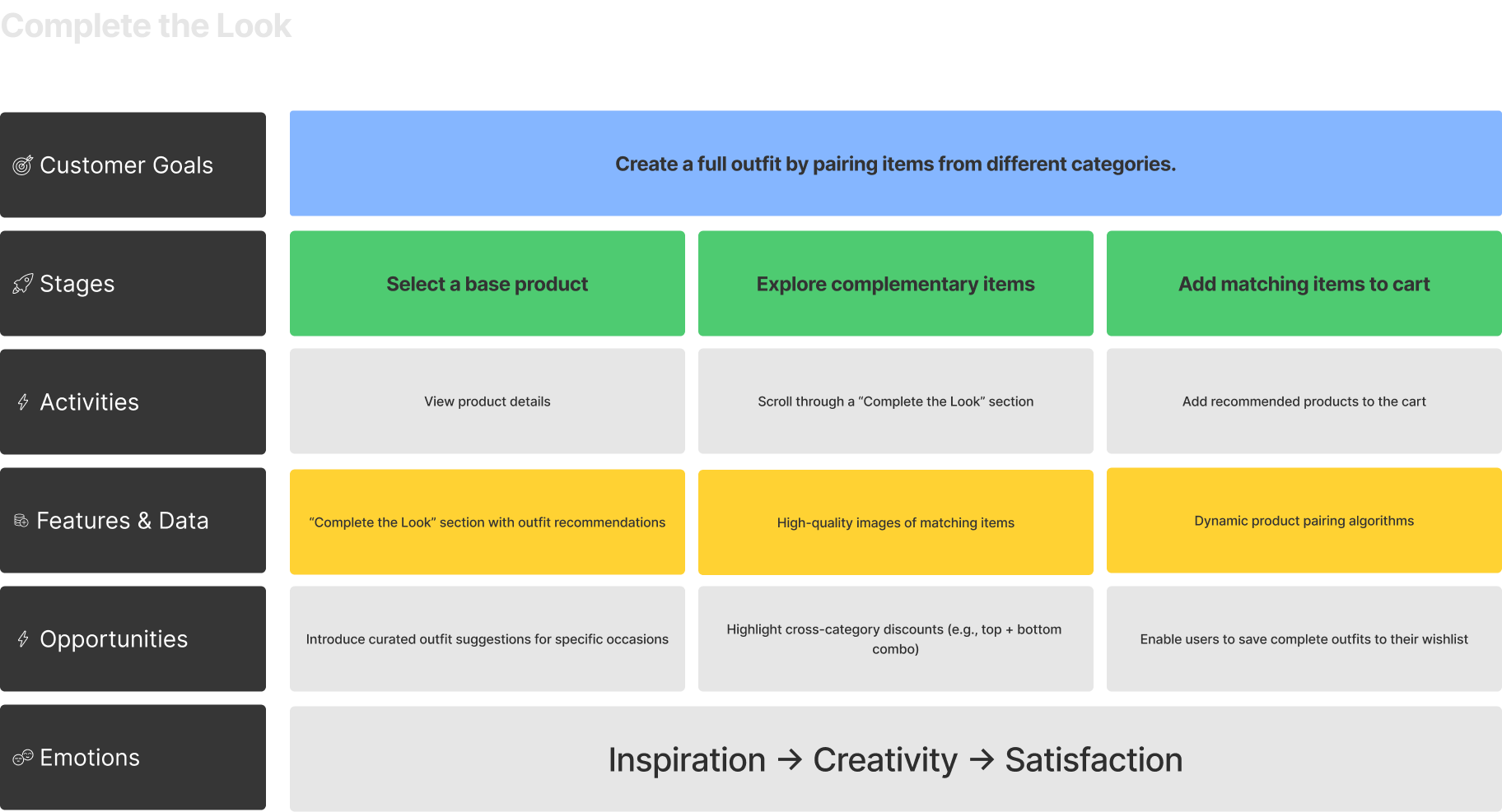
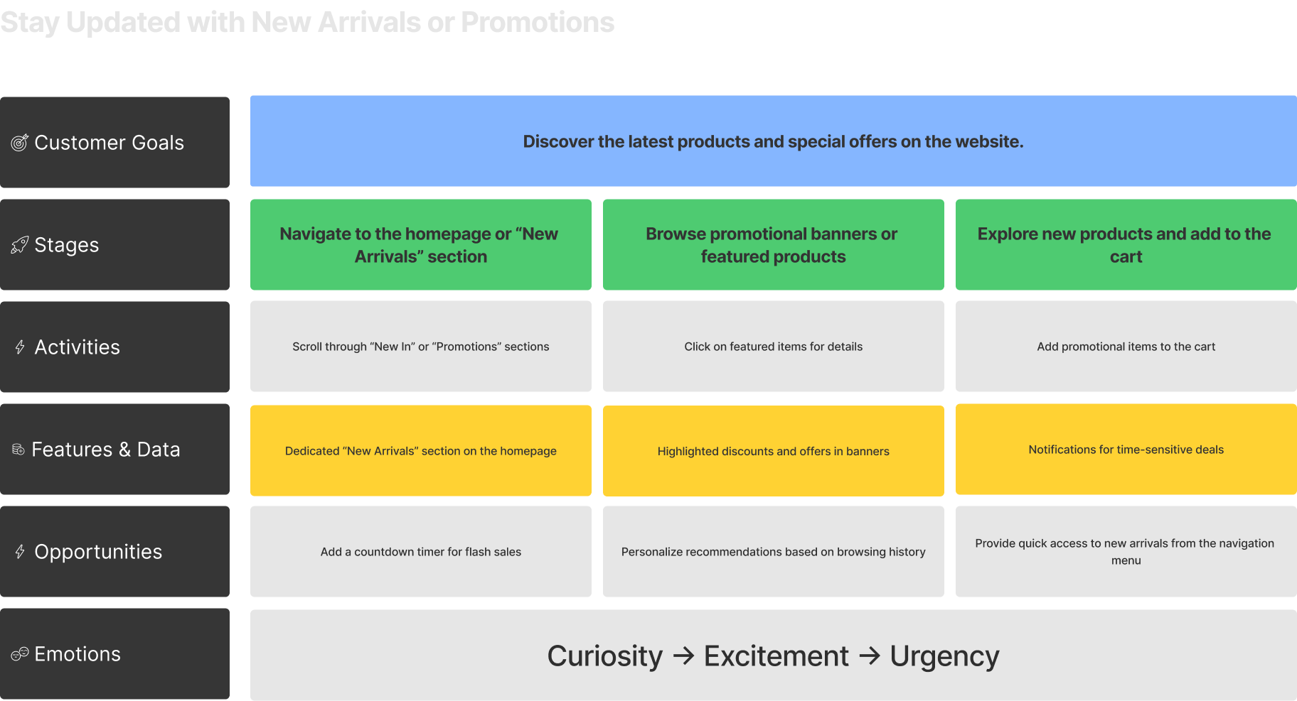
Customer Goals Matrix
I created the Customer Goals Matrix to identify what truly matters to users before making structural decisions.
This step helped me:
👉 prioritize the most important user goals 👉 understand how users move from exploration to purchase 👉 pinpoint where confidence or hesitation appears in the journey.
By focusing on intent rather than screens, the matrix became a clear reference for all design decisions that followed, ensuring the experience was built around real user needs rather than assumptions.
Information Architecture
The navigation was rebuilt around user mental models.
I reorganized the catalogue into clear, gender-segmented hierarchies based on how users browse fashion, not on internal inventory logic.
Iterative structuring ensured clarity and scalability.
Using a card-sorting approach, I refined category groupings through multiple iterations to reduce overlap, improve scanability and keep the menu consistent across women’s and men’s sections.
Wireframing
Turning structure into usable flows before visual design.
Working mobile-first, I mapped the full shopping journey to validate navigation, hierarchy and key interactions.
This step quickly revealed where clarity was missing, where flows needed simplification and how the experience could better support fast, confident decisions.
High-Fidelity design
Purposeful feature expansion
Several new features were introduced intentionally, not to add complexity, but to address gaps identified during research and auditing.
Designed for business growth
At a business level, the new experience enables stronger product curation, better audience segmentation and improved conversion potential.
Developer handoff
💡 The final designs were prepared for development with clear specifications and documentation. At the time of this case study, the project is in the implementation phase, with development planned as the next step following technical and budget alignment.
Project takeaways
This project reinforced the importance of grounding design decisions in real user behavior and business constraints rather than visual trends. Taking the time to audit, research and structure the experience before designing screens made it possible to introduce meaningful improvements, not just aesthetic changes.
The process highlighted how clarity, intentional functionality and strong information architecture can transform an existing platform into a scalable, business-driven product.