BUILDING A SCALABLE INDUSTRIAL BRAND AND DIGITAL ECOSYSTEM FROM THE GROUND UP
Introduction
Aquasafe is a fast-growing industrial company specialised in water-management and wastewater-infrastructure solutions, working with engineers and construction partners.
At the start of the collaboration, the brand had no defined identity, no product architecture and no digital presence.
My role
I led the end-to-end development of the Aquasafe brand. My role included stakeholder interviews, research, creative direction, logo development, product taxonomy, website UX and UI, brand stationery, social media identity and the long-term strategy for awareness and digital expansion.
Tools
Figma, Illustrator, Photoshop, InDesign, Notion, WordPress, Elementor, Google Workspace.
Project Scope
The project involved building the Aquasafe brand and digital ecosystem from the ground up, structured into four key workstreams:
Brand Strategy & Visual Identity
Defined the company’s positioning, personality and tone of voice, then developed a modern industrial identity including the logomark, typography, colour system and brand elements reflecting the technical nature of water-infrastructure engineering.
Content & Product Architecture
Structured all products and services into a scalable taxonomy, reorganised technical information for clarity and created the foundation for how Aquasafe’s solutions are communicated across brand and digital channels.
UX/UI & Website Development
Designed the website architecture and user flows, then implemented the responsive interface directly in WordPress using Elementor, ensuring clarity, flexibility and alignment with the new industrial brand direction.
Stationery & Awareness Foundations
Developed a full stationery suite and shaped the initial awareness direction through consistent branding, photography style and a presentation-focused website prepared for future expansion.
Problem Discovery
Aquasafe entered the market with strong technical expertise but without a coherent identity or an organised product offering. The initial vision was unclear, fragmented and shifting, making it difficult to communicate value, differentiate from competitors and support scaling.
The brand needed clarity, consistency and a digital presence aligned with an industrial audience that requires precision, reliability and fast access to technical information.
Solution
I implemented a complete industrial brand and a scalable digital foundation that makes Aquasafe’s technical offering clear, credible and easy to navigate.
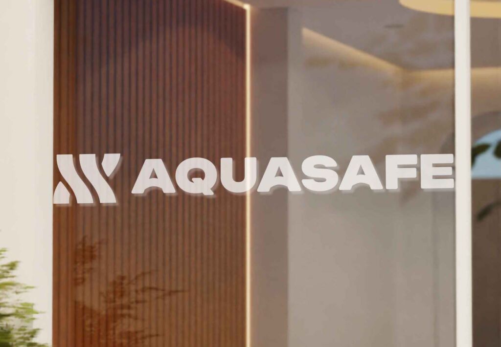
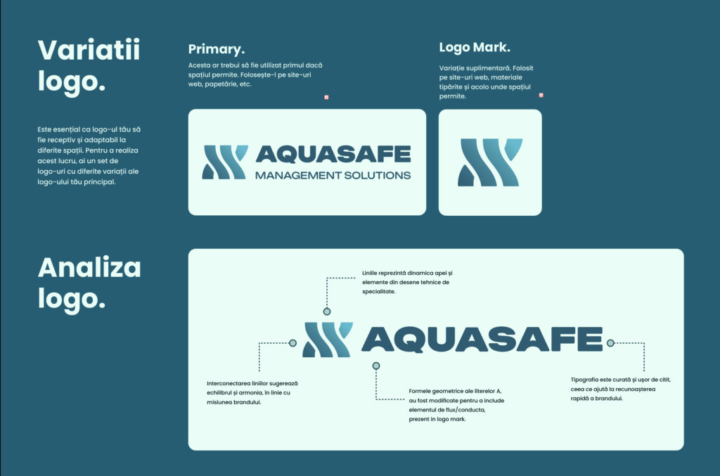
The new Aquasafe identity is built around a custom logomark inspired by technical pipe drawings, paired with a modern industrial colour system and typography.
This combination balances precision and fluidity, reflecting how Aquasafe integrates engineered structures into real environments.
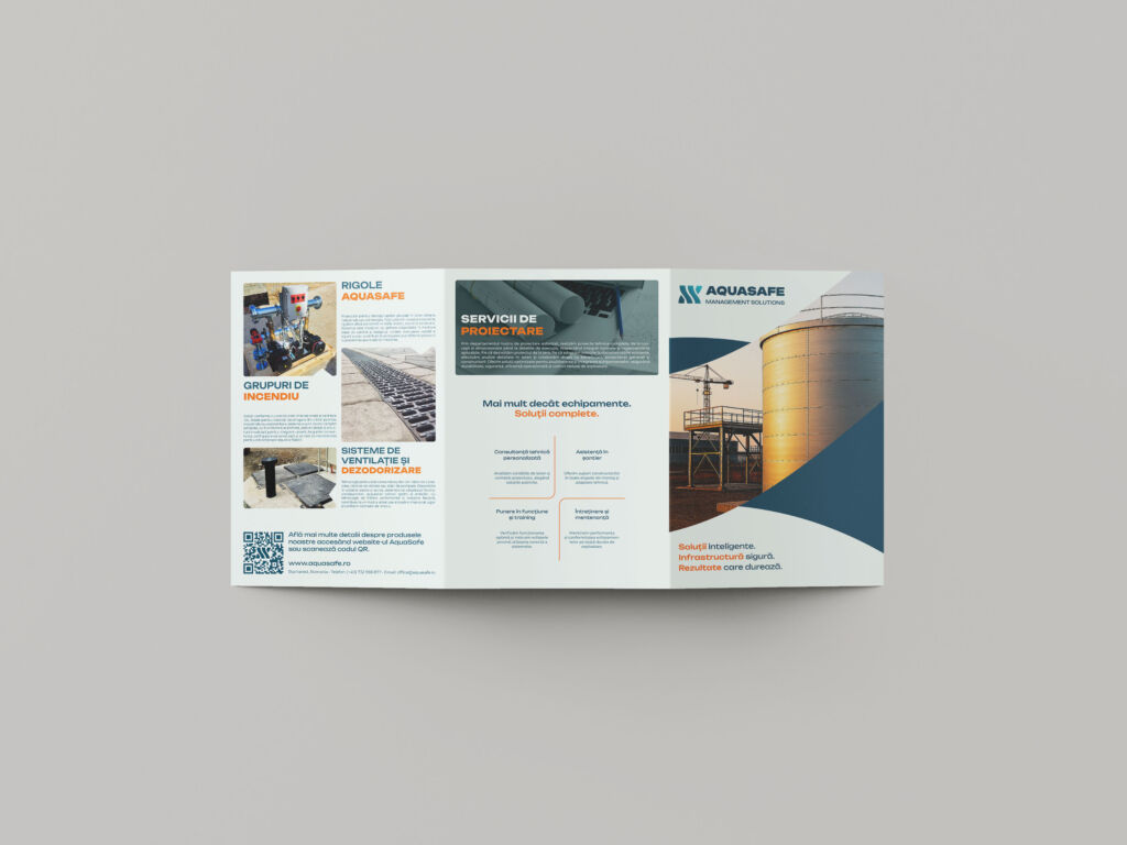
All solutions were reorganised into a clear, scalable product taxonomy that separates categories such as retention systems, hydrocarbon separators, firefighting reservoirs and pumping stations.
This structure guides how information is presented across the website, sales materials and future partner platforms, making complex systems easier to understand.
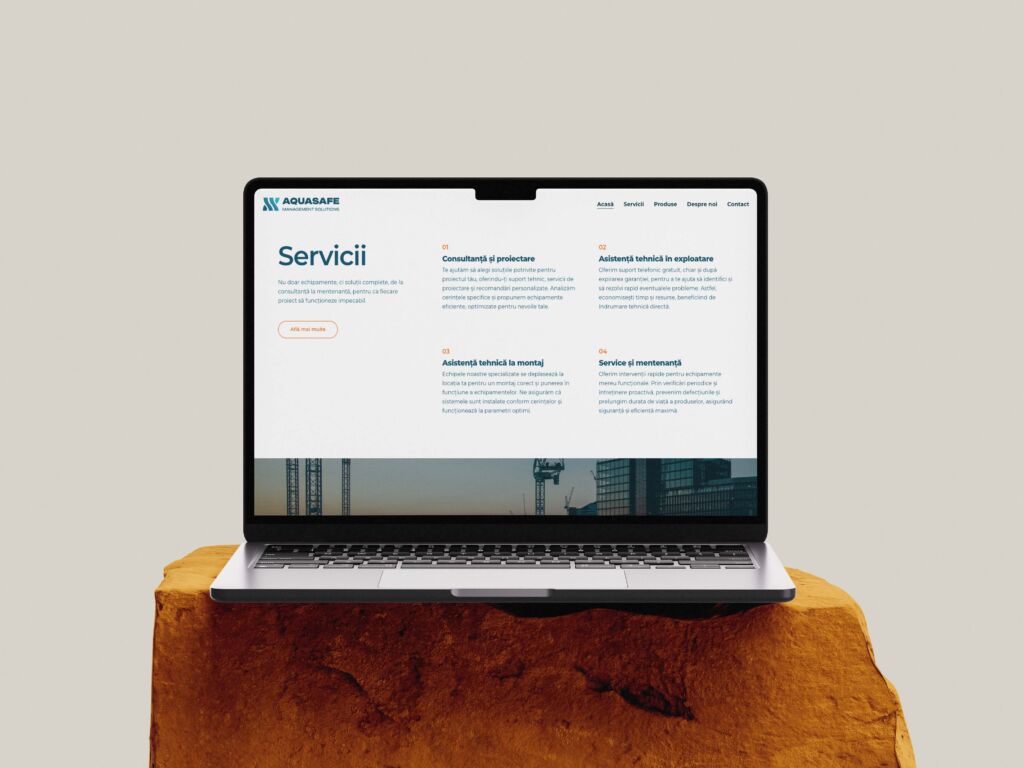
I designed the first iteration of the Aquasafe website as a modular, presentation-focused experience implemented in WordPress with Elementor.
The layout prioritises clarity, responsive access to product information and a structure that can later expand into richer product pages, partner sections and technical resources without breaking the existing experience.
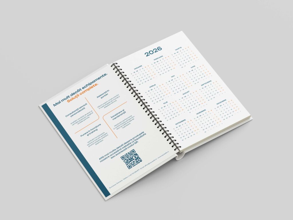
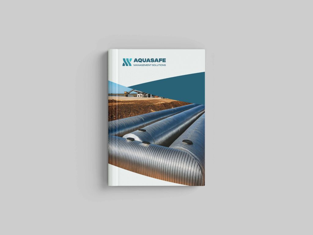
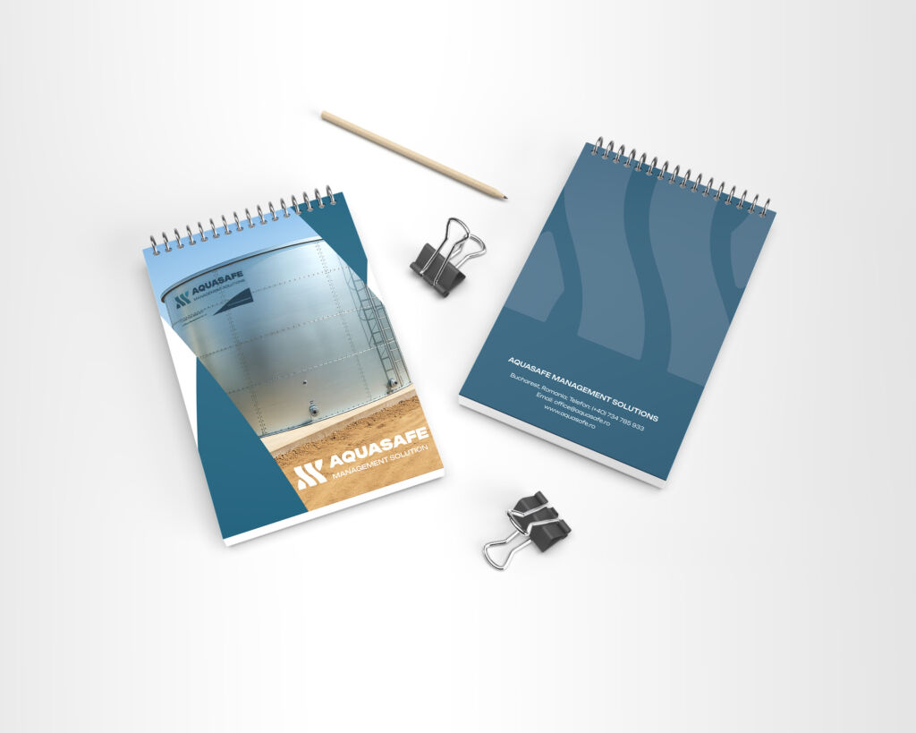
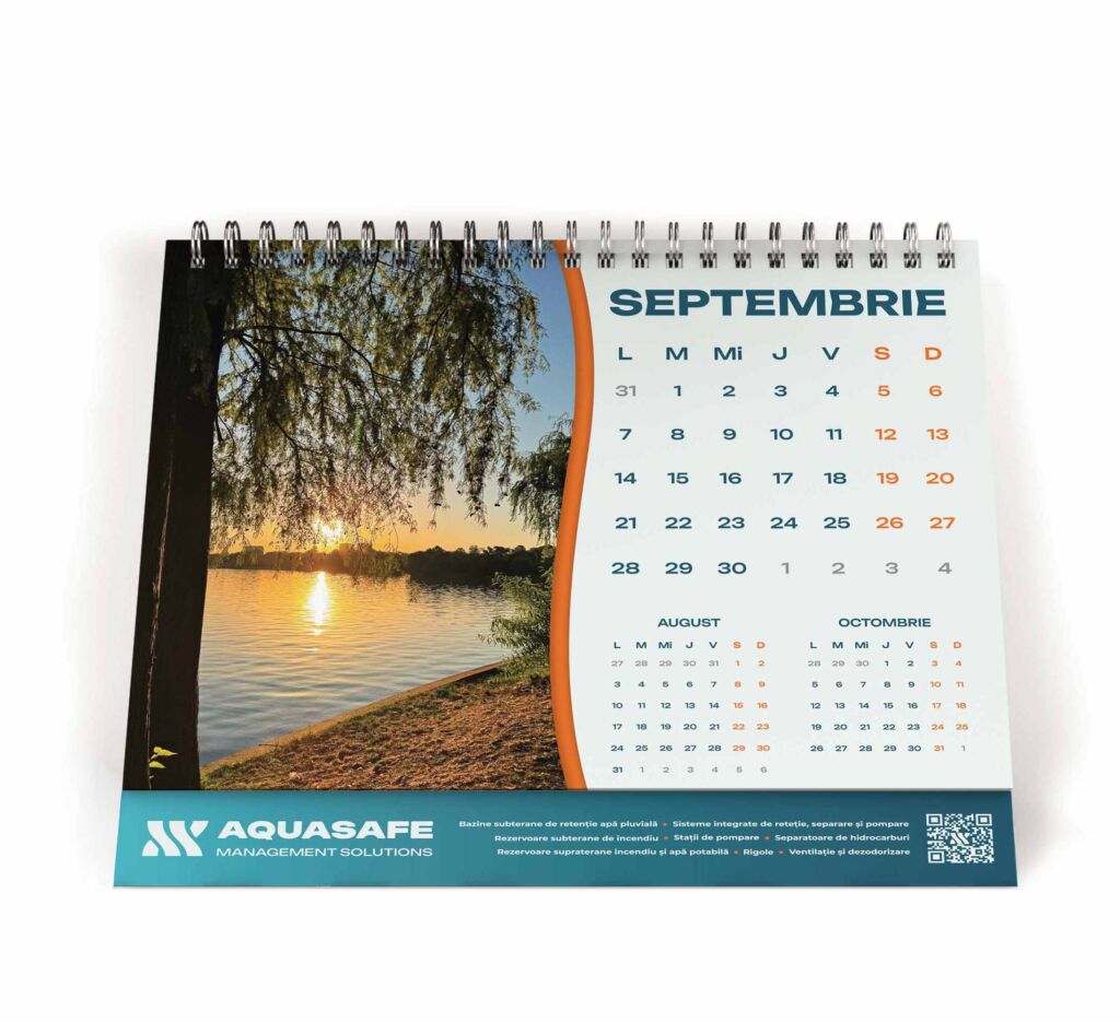
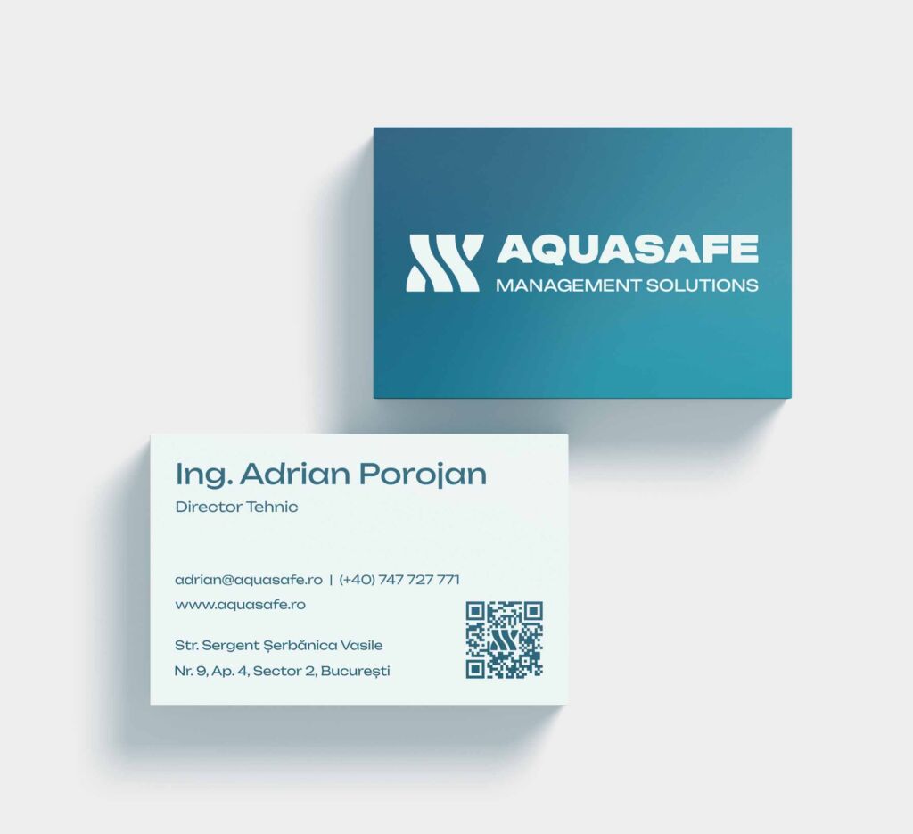
To support offline touchpoints and brand recognition, I developed a stationery system including notebooks, agendas, flyers, calendars, pens and branded bags.
Together with the visual direction for photography and social media, these elements create a consistent awareness layer that introduces Aquasafe as a reliable industrial partner from the very first interaction.
The Process
Discovery
Aquasafe entered the project with a clear technical vision but no consolidated brand direction. The company knew what it wanted to achieve, yet the identity, tone and product structure were still fluid. The discovery phase helped transform these early ideas into a strategic foundation.
The outcome of this phase was a shared understanding of what Aquasafe represents and what it must communicate to build long-term trust in an industrial market.
Stakeholders Interviews
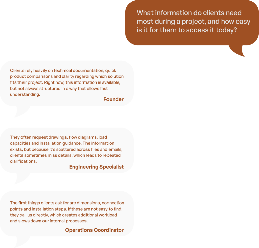
Discussions with key decision makers revealed operational complexity and the need for a brand system that can grow with the business.
To ground the project in real operational needs, I conducted semi structured interviews with three stakeholders: the founder, the operations coordinator and the engineering specialist.
The purpose was to understand how Aquasafe’s solutions are delivered, what information clients rely on during decision making and how the brand and website must support internal workflows.
💡 Insight
Hearing the same pattern from different roles highlighted the need for a brand and digital platform that centralises information, clarifies product categories and reduces dependency on manual explanations.
Identity development
Building the Aquasafe identity was not a straightforward “logo-first” exercise. It was a process of understanding who the company really was, what it aimed to become and how technical the industry actually is.
Nothing felt predefined. The identity grew organically from conversations, iterations and moments where things simply didn’t feel right yet.
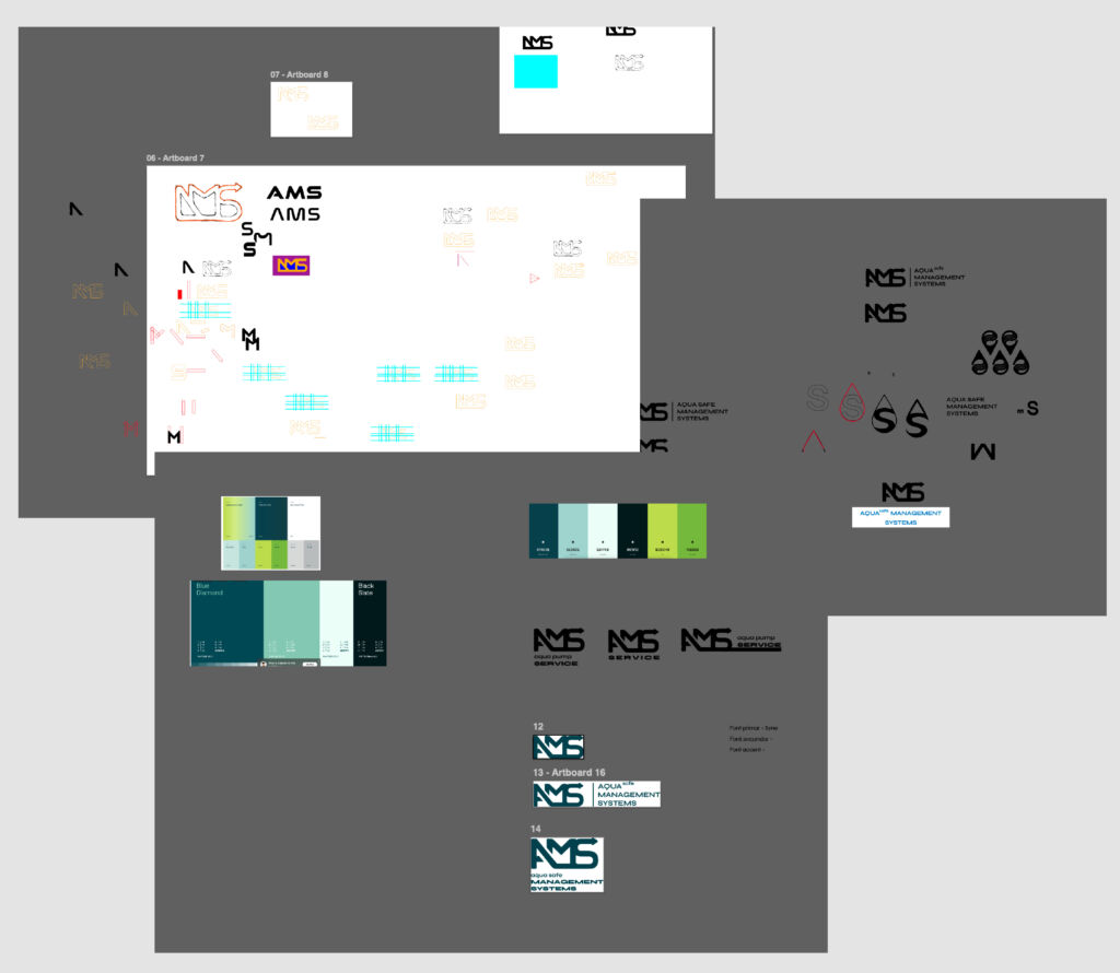
Where it started
The first direction explored the acronym AMS. It made sense on paper and it felt like a natural starting point, but it didn’t feel like Aquasafe.
Every attempt looked disconnected from the technical world the company operates in. The acronym didn’t carry the weight, clarity or personality the brand needed.
It quickly became clear that the name itself needed to be rethought before the visuals.
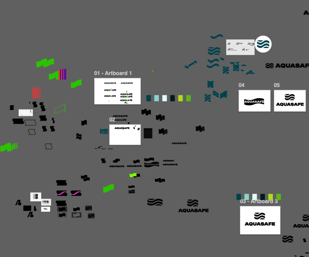
The moment of clarity
During a discussion with the client, the answer appeared naturally.
Aquasafe Management Solutions, fully written, already said everything. The name was strong, complete and recognisable. It didn’t need to be shortened. It needed to be embraced.
Once this decision was made, the visual direction finally had a foundation to grow from.
Understanding what the brand should feel like
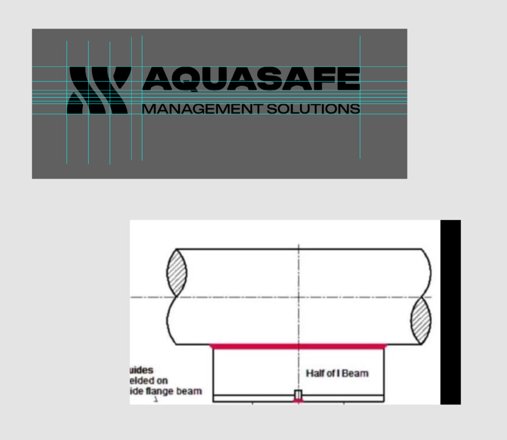
Aquasafe works with pipes, engineered structures, water flow, pressure, resistance. These are rigid, technical systems. But they also interact with fluid environments.
This duality, structure and flow, became the core idea.
The logomark started from a simple question I kept returning to.
How do you make something technical feel modern, but still accurate?
When something changed
Initially, the brand direction leaned toward nature: greens, soft gradients, eco messaging. But at one point the client shifted their perspective entirely. They no longer wanted a nature-driven identity. They wanted an industrial one.
This wasn’t a small change. It meant rethinking the foundation.
Instead of forcing the original direction, I chose to rebuild the palette and positioning from scratch.
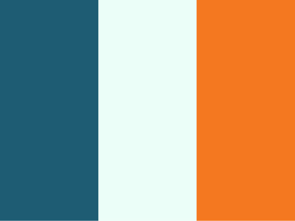
That’s how the orange and teal combination emerged, energetic but technical, modern but grounded.
What the identity ultimately represents
Aquasafe’s identity reflects the reality of the business.
👉 It is technical but not intimidating. 👉 It is modern but not trendy. 👉 It is flexible enough to evolve as the company grows, because the brand itself is still discovering its full voice.
And that’s the most authentic part of this project. The identity wasn’t created “all at once”.
It was shaped the same way the company grows, step by step, with clarity gained along the way.
Product Architecture
Organising Aquasafe’s products into a clear, understandable structure became one of the most important steps in building the brand.
In the beginning, the company had many solutions, each with different technical specifications, variations and factory-dependent configurations, but no unified way to present them. Everything lived in discussions, PDFs, technical drawings and internal knowledge.
My goal was to turn all of this into a coherent system that clients could understand at a glance.
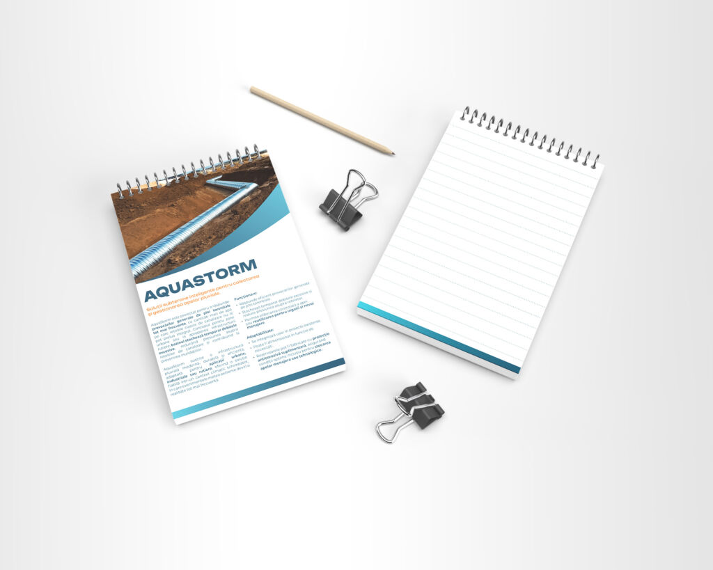
Creating name with identity
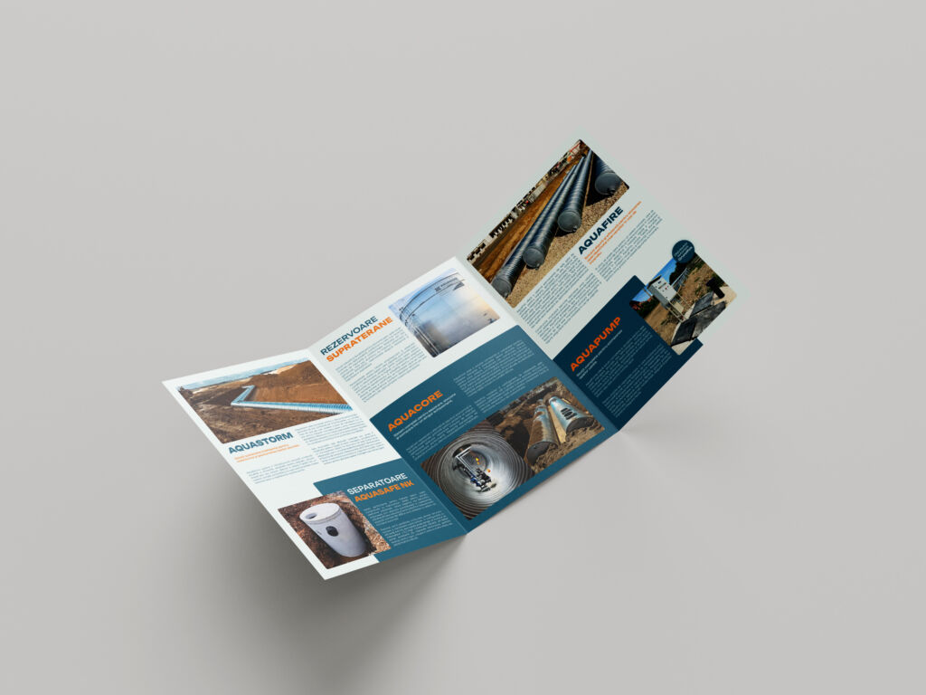
The existing technical names were functional, but not memorable.
By consolidating them into branded product families such as AquaStorm, AquaFire or AquaCore, the offer became easier to communicate and visually consistent. Each name now carries meaning, personality and a direct link to the brand.
💡 Authenticity note
This wasn’t a theoretical exercise.
It came from reading technical documentation, discussing with engineers, understanding factory constraints, naming products in a way that felt natural and translating a highly technical world into an accessible, professional brand.
UX/UI Foundations
When the branding and product architecture were ready, the next step was to give Aquasafe a place to exist online.
At that moment, the company had no website at all, so the goal wasn’t to deliver a complete platform with technical pages and specifications. The priority was to create a first version that introduced the brand, presented the product families and offered a clean, trustworthy digital presence.
The website you see today is a true MVP.
A starting point.
A foundation that will grow once the company finalises documentation, technical details and product structures internally.
A digital foundation that will grow
The current website is intentionally minimal.
As Aquasafe develops more detailed documentation, technical drawings, installation instructions and product variations, the digital experience will expand into a more structured system.
The next iterations will include:
👉 individual product page
👉 technical specification downloads
👉 clearer navigation per category
👉 improved content hierarchy
👉 case studies and project documentation
These are not hypothetical additions. They are already in discussion and aligned with the company’s plans.
Stationery & Awareness
As the brand identity started to take shape, an important part of the project was bringing Aquasafe into the physical world. The company needed materials that could introduce the brand, explain its products and support meetings with partners, clients and construction teams.
💡 This phase helped transform the identity from something conceptual into something people could actually hold, use and interact with.
Project takeaways
Working on Aquasafe taught me how important it is to build a brand slowly, with intention, and to let the identity grow at the same pace as the company behind it. Nothing about this project was linear. Every step required adaptation, patience and a deep understanding of how the business actually operates.
I learned that creating a technical brand means listening more than designing. The conversations with the founder and the team shaped the identity just as much as the visual exploration. The iterative process, the shifts in direction and the constant need for clarity helped me design not just a visual system, but a foundation the company can truly build on.
Aquasafe is still evolving, and so is the design work. This ongoing nature of the project has been one of the most valuable experiences for me. It reminded me that good branding is not a one time deliverable. It is a partnership, a continuous refinement and a dialogue between the designer, the team and the reality of the industry. And that is what makes this project meaningful.