FULL VISUAL IDENTITY DESIGN FOR A PREMIUM PEDICURE STUDIO
Introduction
Ana Păun Pedicure is a personal care studio specializing in both medical and aesthetic pedicure services.
The goal of this project was to create a refined, trustworthy and coherent brand identity that reflects the clinic’s values: authenticity, confidence, professionalism and a calm, restorative experience for its clients. The new identity needed to feel elegant and warm, while communicating expertise and meticulous care.
My role
Brand Designer responsible for the full visual identity system: concept development, logo design, typography system, color palette, illustration assets, brand patterns and the final brand guidelines document.
Tools
Adobe Illustrator, Adobe Photoshop, Figma
Project Scope
The project focused on developing a complete and cohesive visual identity system for the brand, structured into four key pillars:
Brand Strategy & Positioning
Defined brand values, personality and positioning based on the client’s vision. Translated concepts like authenticity, confidence and refinement into a clear brand direction and visual narrative.
Logo System & Visual Identity
Created a full logo system ensuring proper spacing, responsive usage and visual coherence. Developed a complete typography hierarchy and color palette aligned with the brand’s desired tone.
Illustration Style & Pattern Design
Designed a custom botanical pattern inspired by floral motifs and subtle natural elements, reflecting care and elegance. Extended the graphic system with decorative assets to strengthen brand recognition across touchpoints.
Brand Book & Applications
Compiled a comprehensive brand guidelines document covering logo usage, color rules, typography, patterns and do’s & don’ts. Developed mockups demonstrating real-world applications such as business cards, packaging and signage.
Problem Discovery
Before this project, the brand had no unified identity that reflected its core values or the premium quality of its services.
The challenge was to design a visual system that balances medical professionalism with an intimate and relaxing atmosphere, building trust for clients who often come with sensitivity or insecurity around foot health.
Solution
01. Brand Overview
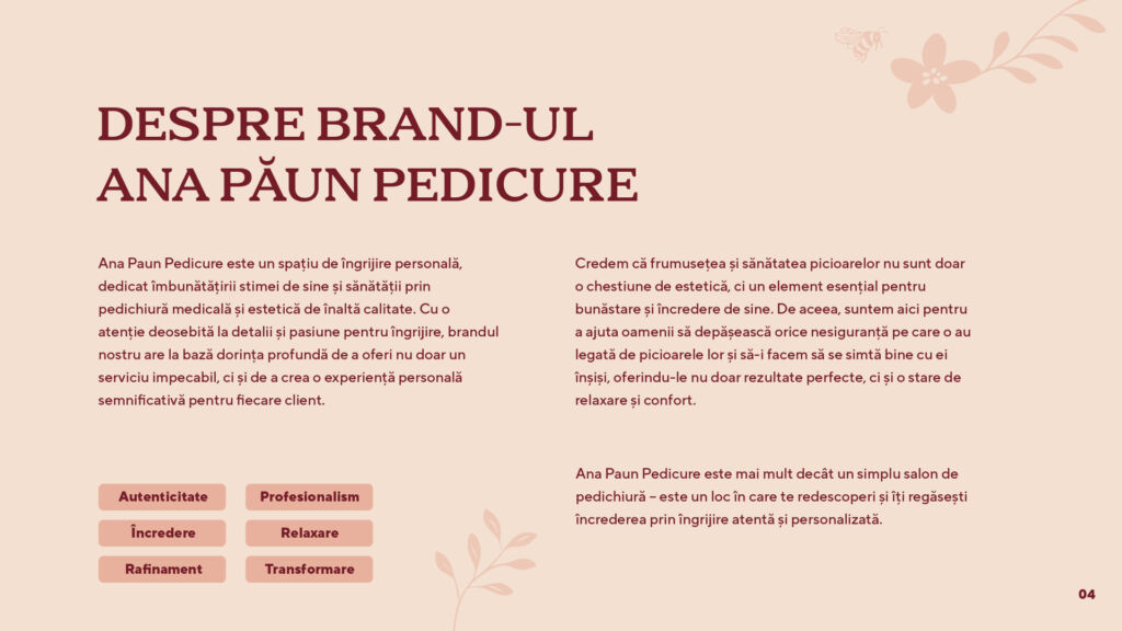
The brand identity was built around values such as authenticity, confidence, refinement and a sense of calm personal care.
These pillars informed every visual decision, ensuring that the brand reflects both professionalism and the warm, restorative experience clients feel in the salon.
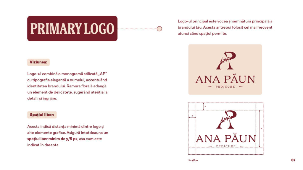
02. Primary Logo
The primary logo combines a stylized “AP” monogram with a delicate floral branch, balancing elegance with attention to detail.
It was designed to work as the brand’s main signature and to ensure high recognizability across all touchpoints. Proper spacing rules were defined to maintain clarity and visual harmony.
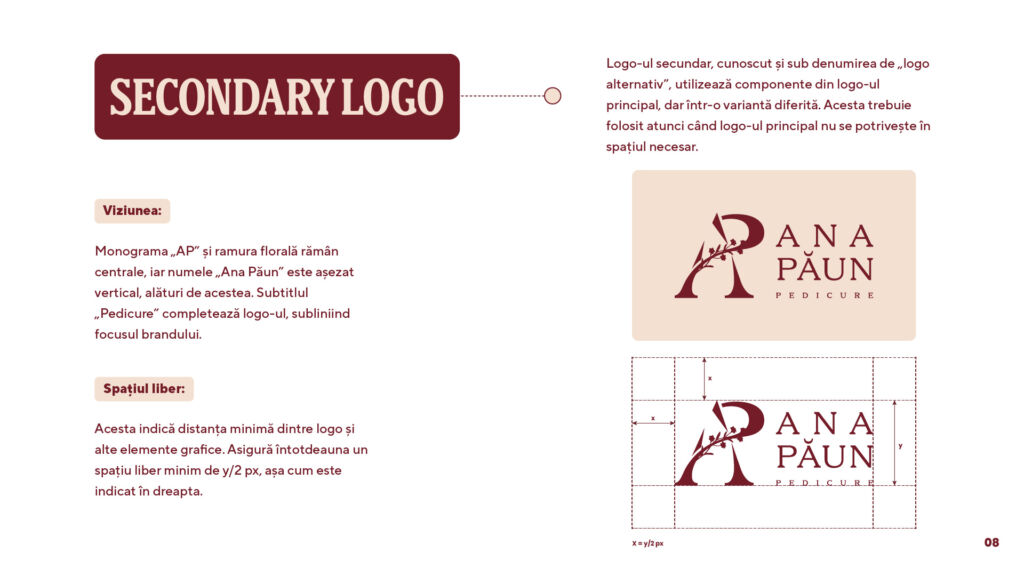
03. Secondary Logo
A vertical composition was created to provide flexibility in narrower or constrained layouts.
The monogram remains central, supported by a refined typographic arrangement, allowing the brand to stay consistent even in alternative formats.
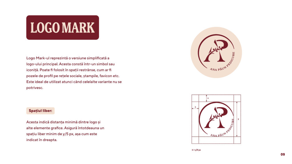
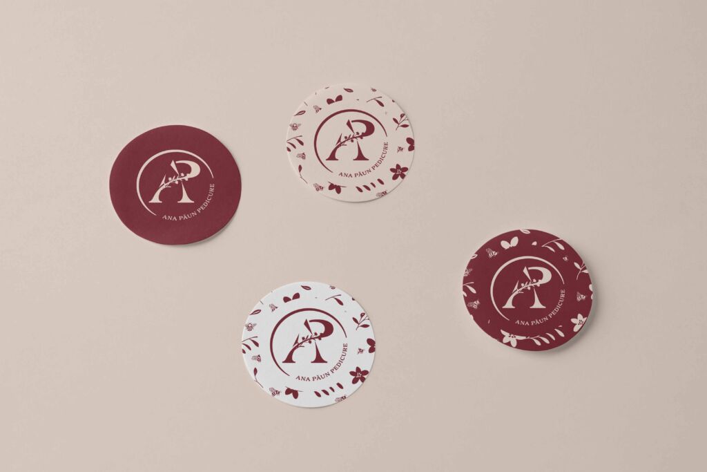
04. Logomark
The logomark distills the brand into its simplest and most iconic form.
It is ideal for small surfaces such as social media avatars, stamps, favicon or minimal packaging. Its minimal structure ensures legibility even at very small scales.
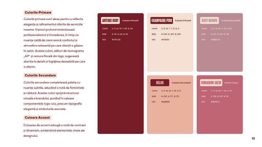
05. Color Palette
The palette combines a deep Antique Ruby with soft neutrals to create a calm, elegant and premium atmosphere.
Secondary tones add warmth and femininity, while the accent color brings contrast and visual balance. This palette forms the emotional foundation of the brand.
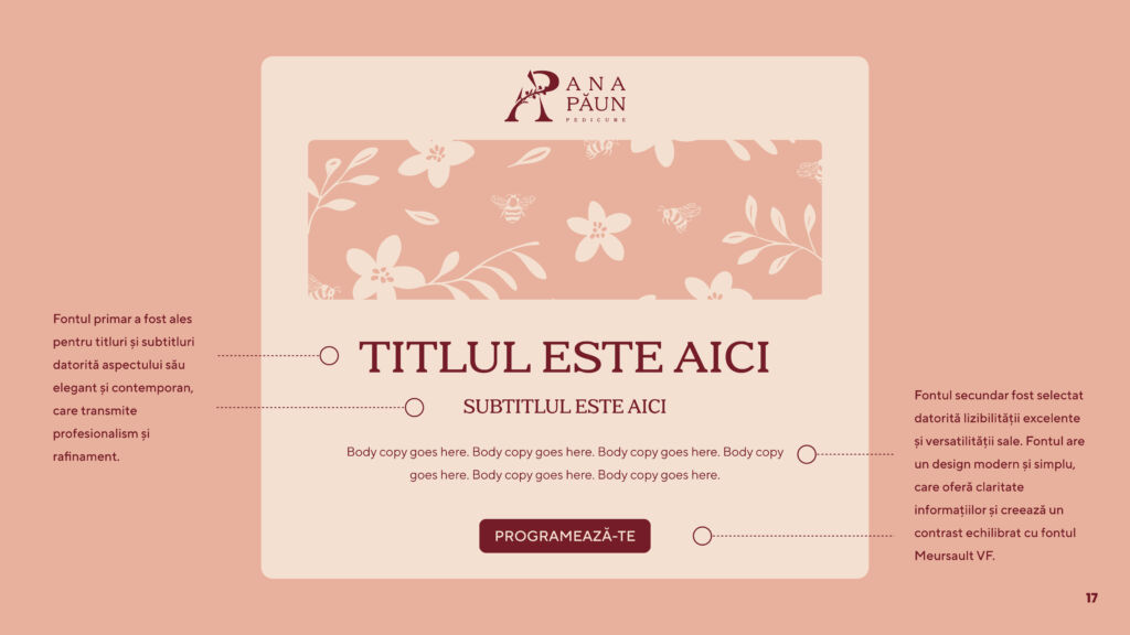
06. Typography System
The typographic system pairs a refined serif display (Meursault VF) for titles with a clean, modern sans serif (TT Norms Pro) for body copy, ensuring both elegance and readability.
A script font supports selective decorative uses, enriching the brand’s personality without overwhelming it.
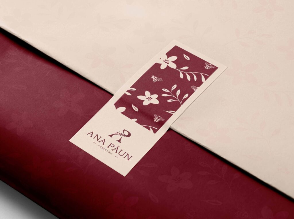
07. Illustration & Pattern
A custom botanical pattern was developed using floral and bee motifs, symbolizing care, attention and natural beauty.
This visual asset strengthens the brand’s personality and can be applied across packaging, printed materials and interior elements for cohesive brand expression.
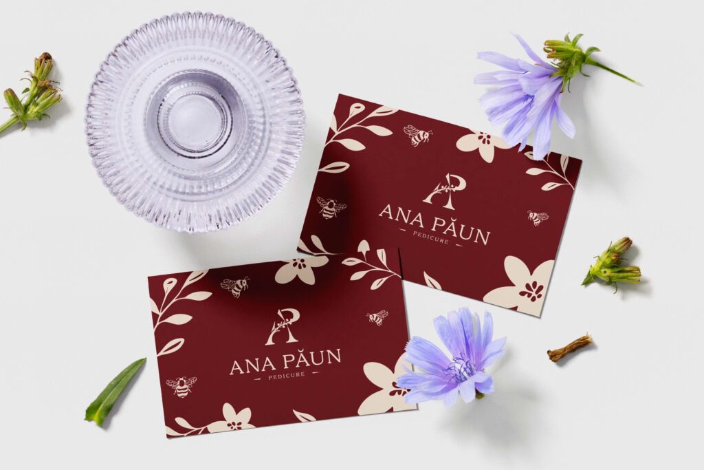
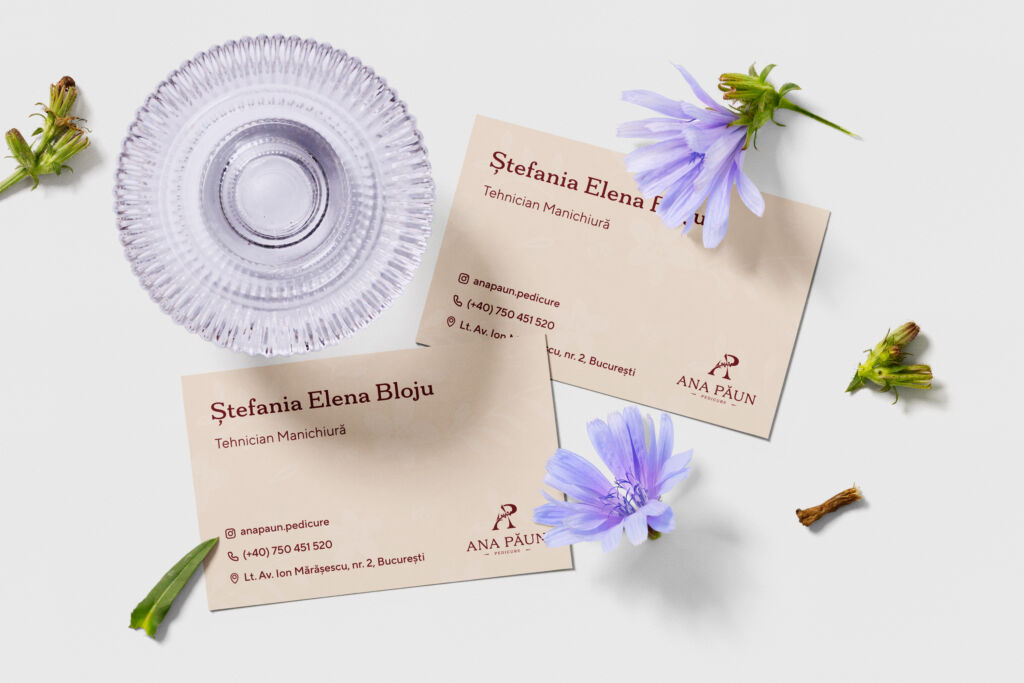
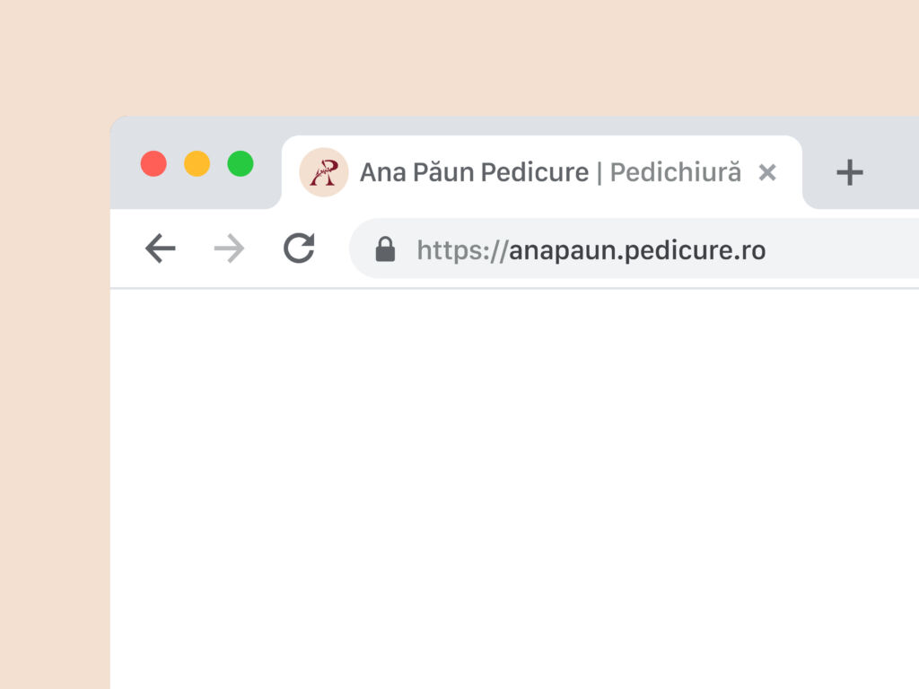
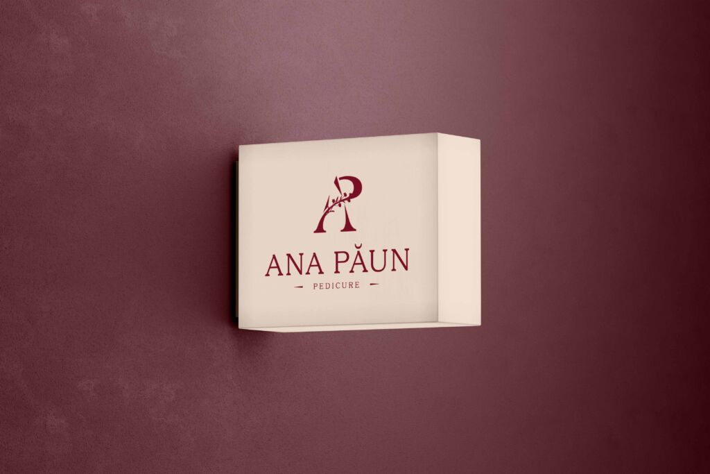
08. Brand in Action
A set of mockups showcases how the visual identity performs in real-world scenarios including business cards, labels, packaging and signage.
These applications demonstrate consistency across formats and reveal the brand’s final look and feel.
Project takeaways
This project strengthened my approach to building brand systems that feel both strategic and emotionally resonant. Working with a service rooted in personal care required a balance between aesthetic refinement and functional clarity, ensuring the brand inspires trust at every touchpoint. The final identity captures exactly that balance: a calm, elegant and confident presence that reflects the warmth and professionalism of the salon.